Thursday, 26 February 2009


supah dupah rough idea for an invite because i can't find kate's email address anywhere and facebook really isn't made for picture messaging. 


wherein i totally rip off rodchenko.

oh alex, lettering by hand is such a no-no.


brain storming for the student paper and OH MY GOD, WHY DOES MY SCANNER INSIST ON SCANNING EVERYTHING AT REALLY AKWARD, FUNKY ANGLES!?!

Tuesday, 24 February 2009


i'll give you a guess what this is a page of. two words. first begins with an 'l' and the second begins with a 'd'.

WHATEVER COULD IT BE!?


life drawings... FROM LIFE.

seriously though, this is like my number one hobby (although i blatantly just go to sate my closeted perverted, voyeristic tendancies...).

.
..
...

wait. i didn't just type that, did i?


life drawing.

nuff said.


oh, those crazy greeks. they were the model of the nuclear family.

something that was crapped out while waiting for filmo to bake.

Saturday, 21 February 2009


oh lol, this has about as much depth perception as a cyclops... aaaaaaand shouty old men are still probably one of my most favorite thing to draw.

check out the alien hand going on in the left hand side of the lower panel.

Wednesday, 18 February 2009


brain storming for issue #2 of folio. ramblings leftover from an email.

#1- basically, i couldn't come up with j/s at first so i thought i'd milk the net idea for all it's worth. gimmicky, but not thematically accurate.

2#- wooooooow, shitty drawing. basically, the idea was to have this little homely house amidst this sprawl of faceless tower blocks. kinda like it and i swear to god i can actually draw buildings from above (...most of the time).

3#- go figure.

4#- bwuah? man sitting inside an alcove in someone's chest? i was trying to play around with the whole 'home is where the heart is mantra but i think i took it a little too surreal-y.

5#- unlike here. where there's a little house shaped hole where little miss emo's heart should be. like the idea, but would draw it differently; at the moment, that pen sketch smacks of meh.

colour? lol, whutz that?


OH TEH DRAMA!

colored version. i'm  loving the fact everyone has glow in the dark teeth.


life drawing.

what, is monotone flavor of the month or something?

Tuesday, 17 February 2009


bleated happy friday 13th, y'all! 

leftovers from a sketch jam. what with the remake coming out and all, we figured jason vorhees would be a pretty appropriate topic for this week's doodle-fest. on retrospect, should have probably gone with a slightly more atmospheric approach, but what the hell. these are only meant to be quickies.

CH-ch-ch-CHA-cha-cha!

Sunday, 15 February 2009


aaaaaaaand that's that. many, many thanks to ben's sparkly photography skills. man's got a neat eye for composition, yo.

Friday, 13 February 2009


and now back to our scheduled programming- the ongoing drama that is the 'mrs. o' poster. just a little mock up for the photos. they actually turned out a whole lot better than this, but i'd put that down to ben's super sweet photo skills rather than my 'creative' input.


work in progress- pencils from the last page of the web comic i'm doing with Q. i like the first two thirds of this. you were doing so well... and then you've got that last panel with the hood charging the guy from COMPLETELY the WRONG ANGLE.

*slow clap*

in other news, i really, REALLY like drawing feet. i'm wondering if it's some kind of subconscious fetish...

Thursday, 12 February 2009


so yeah, initially i had an idea to illustrate mrs o by the dresden dolls with a pseudo war time propaganda poster thing  (kinda fits the themes of the song. i think it's all about how we're so very good at pulling the wool over our eyes in light of human atrocities, particularly those committed in times of war [/] pretentious babble). 

one of the camberwell tutors was all like 'think bigger' and came up with the idea of USING the poster rather than just making an image which seemed pretty cool and progressive (... for me) so ben and i are off tomorrow to take pictures. fun times.

in retrospective, choosing to go with the hairdryer line was a poor choice.

coincidentally, HOW MUCH FUN IS SUPER SCULPY!? 
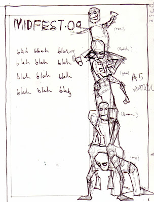
Wednesday, 11 February 2009


so for the FMP last year i got this crazy idea into my head that i'd make this multi-media illustrated  song book contraption. the tutors were all like 'dude, this is stupid. you're biting off way more than you can chew.' and funnily enough, they were totally right.

NOW, however, i'm putting together a shiny new portfolio and i thought i'd go back and revisit some of the better ideas i had for that, this being part of one of them. more on that later though. in the mean time, OHMYFREAKINGGOD, text layout is quite possibly the most frustrating thing ever, especially if you're a total spaz-tard like me who lacks even a semblance of an eye for design. happy with the home made textures though...  

TO BE CONTINUED

Tuesday, 10 February 2009


left overs from the planning page. urgh... maths and scaling hurt my grey matter. 

... i don't know why the robot's there either.


and now for something completely re-goddamn-diculouse. as you can see from the photographic evidence, this actually works... kinda.

this is why i shouldn't be allowed to make people birthday cards.

Sunday, 1 February 2009


more work sheet stuff for portfolio junk. this is a lot more jam packed than the normal fair but i was trying my hand at something slightly more technical and maths and grid paper  got involved.

...i HATE maths and grid paper. srsly, my darkest nightmares wold involve some kind of algebraic fraction that you'd have to plot on a graph but thank god nothing so heinous acctually exists, right?

right?

wait... what's this?


OH GOD!


and here's the final thing. i adjusted the colors on those terrible, terrible planes and slapped on a layer of texture so hopefully it's looking a little better.

now that means i'm free to concentrate  all my cringing at that wonderful typography!